
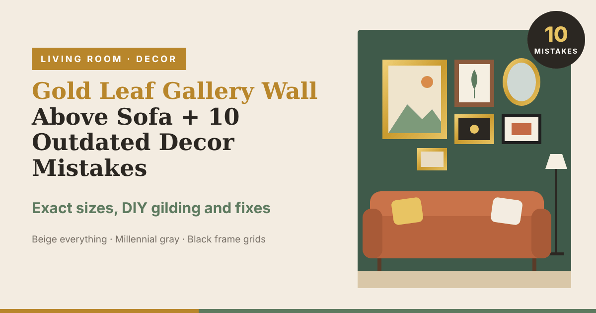
We all know that one friend who did their living room in 2019 and has not touched it since. Gray floors, gray sofa, a grid of nine black frames above the couch with the same black and white photos inside, and a round fluffy bouclé chair in the corner that nobody sits on. It looked great on Pinterest back then. Now it looks like every rental listing on Zillow.
If you are reading this and thinking “wait, that’s my living room”, don’t panic. You don’t have to throw everything out. Most of these rooms are one or two changes away from looking fresh, and the easiest place to start is the wall above your sofa, because it’s the first thing anybody sees when they walk in.
That’s why this article starts with the gold leaf gallery wall. It’s a warm, mixed, slightly old fashioned way to fill that space, and it fixes one of the most dated looks of the last ten years. After that, you will find 10 decor mistakes that designers say are outdated in 2026, with the fix for each one.
Why the Gold Leaf Gallery Wall Is Replacing the Black Frame Grid
For years the standard gallery wall was six or nine identical thin black frames, hung in a perfect grid, with white mats and prints from the same online shop. Designer Janelle Patton of Lark Interiors told Apartment Therapy in June 2026 that these gallery wall grids read “more like a checklist than a choice.” Hard to argue with that. Everybody owns the same one.
A gold leaf gallery wall goes the other way. Gold leaf is metal beaten into sheets thinner than paper, then laid over a frame or a painted surface. It catches lamp light at night in a soft way that flat gold spray paint never does. Instead of one frame repeated nine times, you mix gilded frames of different widths and shapes, and put in oil paintings, old botanical prints, small mirrors and maybe one family photo. It looks like you collected it over years, even if you bought half of it last month at a thrift store.
You also don’t need to go full French palace. Two or three gilded frames mixed with natural wood and one painted frame is enough to make the whole wall feel warm.
How to Plan a Gold Leaf Gallery Wall Above Your Sofa
Getting the size wrong is the most common reason a gallery wall above the couch looks off. Use these numbers.
Width. Studio McGee says art above furniture should be about two thirds the width of the piece. Frameology, which sells frames, gives a range of two thirds to three quarters of the sofa width. So for a common 84 inch sofa, your whole arrangement should be about 56 to 63 inches wide. For a 72 inch loveseat, aim for 48 to 54 inches.
Height above the sofa. Studio McGee puts the bottom edge 4 to 6 inches above the top of the furniture. Frameology says 6 to 8 inches, and 6 inches if your sofa back is taller than 36 inches. Go lower rather than higher. If the frames float up near the ceiling, the wall and the sofa stop looking like they belong together.
Center of the group. Both sources put the middle of the whole arrangement around 57 to 60 inches from the floor. That’s roughly eye level for most adults.
Space between frames. Keep 2 to 3 inches between every frame. When gaps are uneven, the wall looks messy, even if the frames themselves are nice.
Plan on paper first. Trace every frame on kraft paper or old wrapping paper, cut them out and tape them on the wall with painter’s tape. Mark where the nail goes on each paper. Leave it up for a day or two, look at it in the evening with the lamps on, then hammer straight through the paper.
Pick the Right Mix of Frames
A good starting set for an 84 inch sofa is one large piece around 24 by 30 inches, two medium pieces around 16 by 20 inches, and three or four small ones between 8 by 10 and 11 by 14. Put the large piece slightly off center, not dead center, and build the rest around it.
For the frames, try something like this: three gilded frames (one ornate, one plain, one thin), two natural wood frames, and one small mirror. If every frame is gold, it starts looking like a hotel lobby.
For what goes inside, mix it up. A small oil landscape from a thrift store, a vintage botanical print, a black and white family photo, a child’s drawing, a pressed flower. The gold holds it together, so the art doesn’t have to match.
DIY: Gild a Thrifted Frame Yourself
Thrift stores have shelves of ugly frames with good shapes. You can gild them on a Saturday afternoon.
- Clean the frame and lightly sand any shiny finish so the paint can grip.
- Paint a base coat in a deep red or warm ochre acrylic. Old gilders used a red clay layer under gold, and a little red showing through the cracks looks right.
- Brush on a thin coat of gilding size (the glue for leaf). Wait until it turns tacky. The wait time is printed on the bottle, so follow it.
- Lay the leaf on with a soft brush or a gloved finger. Don’t worry about cracks or gaps. Those are what make it look old.
- Brush away the loose flakes with a soft, dry brush.
- Seal it with a clear spray sealer if you used imitation leaf. Imitation gold leaf is usually brass, and it can darken over time if you leave it unsealed. Real gold leaf does not tarnish, but it costs a lot more.
Cost: about $10 to $20 for a pack of imitation gold leaf, $8 to $15 for gilding size, $10 for a soft brush set, and $3 to $15 per thrifted frame Time: 2 to 3 hours of work, plus drying time
10 Decor Mistakes That Are Outdated in 2026
The gold leaf gallery wall fixes the first mistake on this list. Here are the other nine, with what designers said about them and what you can do instead.
1. A Grid of Matching Black Frames
This is the one we just talked about. Nine identical frames in a perfect grid look like they came out of one box, because they did. Janelle Patton’s “checklist” comment in Apartment Therapy says it well.
Do this instead: Mix frame sizes, materials and finishes. If you want to keep your black frames, swap out three of them for gilded or wood ones, and change the layout from a grid into a loose cluster.
2. All Beige Everything
Beige sofa, beige rug, beige walls, beige throw pillows, beige vase with beige dried grass. Designer Ashley Ferguson told Apartment Therapy, “We are ready to retire the RH aesthetic: all beige everything.” Peggy Haddad told Sunset the all neutral look “has officially run its course,” and Jennifer Davis of Davis Interiors told Homes & Gardens that “one-note neutrals are losing their impact.”
Do this instead: Keep the beige sofa. You paid for it. Add color around it with a rust or olive throw, a patterned rug, a dark green or terracotta wall behind it, and your gold leaf gallery wall above it. If you are not sure which two colors go together, our two colour combinations for bedroom walls list has real paint codes that work in living rooms too.
3. Millennial Gray Floors and Walls
Gray wash floors, gray walls, gray sofa. It was everywhere from about 2012 to 2020. Designer Reanna Channer told Sunset, “After a decade of ‘millennial grey,’ we are craving warmth in interiors.”
Do this instead: You probably can’t rip out your floors this weekend, and you don’t have to. Lay a warm wool or vintage style rug over the gray floor, paint the walls a warm white or soft greige, and bring in wood furniture in honey or walnut tones. Warm bulbs (2700K) help a lot too.
4. A Matching Furniture Set From One Store
The sofa, loveseat, armchair, coffee table and two end tables all from one collection. Homes & Gardens said in February 2026 that matching living rooms “are starting to feel rather boring.” Designer Katie Kiser of Katie Kiser & Co. told them, “It’s all about the tension between the unexpected pairings.”
Do this instead: Swap one piece. Sell the matching armchair on Facebook Marketplace and buy a vintage wood chair or a leather one. Replace one end table with a small stool or a stack of books. Two odd pieces is enough to break up the showroom look.
5. Every Wood Tone Matching
Oak floors, oak table, oak shelves, oak frames. Burcu Ercetin, founder of Design & Curations, told Apartment Therapy, “Mixing tones, such as walnut and oak, creates depth.”
Do this instead: Pick one main wood and add one or two others that are clearly different, not almost the same. Light oak with dark walnut works. Light oak with slightly-less-light oak looks like a mistake.
6. Industrial Pipe Lamps and Edison Bulbs
Black pipe shelves, cage pendants, bare Edison bulbs hanging over a gray room. Alexis Pew of Kaminski + Pew told Apartment Therapy, “The industrial fixtures that support the gray rooms are starting to look a bit tired.”
Do this instead: Change the shade, not the wiring. A pleated fabric shade or a rattan pendant fits most standard fixtures. For lamps, look for ceramic or brass bases. Brass sits nicely next to gold leaf frames.
7. The Giant Round Bouclé Cloud Chair
The round, puffy, cream bouclé chair that looks like a marshmallow. Janelle Patton told Apartment Therapy the giant round cloud chair “has run its course.”
Do this instead: If you already own one, give it some company. Put a vintage side table and a floor lamp next to it so it looks like a reading corner, not a photo prop. If you are shopping now, look at chairs in leather, velvet or a woven fabric with a wood frame you can see.
8. Stark Black and White Everything
White walls, black window frames, black hardware, black and white art, black and white rug. Reanna Channer told Sunset this look “feels cold and harsh on the eyes.”
Do this instead: Swap the bright white walls for a softer, creamier white. Change a few black things to brass, wood or a muted color. Even swapping the black curtain rod for a brass one makes the room warmer.
9. Reeded and Fluted Everything
Fluted kitchen islands, reeded glass cabinets, fluted side tables, fluted tile. Peggy Haddad told Sunset the trend “has been so oversaturated,” and Clara Jung of Banner Day Interiors said fluted tile “feels a bit overwrought.”
Do this instead: One fluted piece is fine. Five is a showroom. Keep your favorite and let the rest of the room have flat surfaces, plain wood or a pattern that isn’t ridges.
10. Fake Arches and Features the House Doesn’t Need
Painted arches on flat walls, foam arch trim, curved cabinets in a boxy 1990s house. Kailee Blalock of House of Hive Design Co. told Homes & Gardens these are “architectural moments that don’t belong in the home.”
Do this instead: Work with what your house already has. If you want something on a plain wall, picture frame molding or a gallery wall adds interest without pretending to be a different style of house.
What About the TV Above the Fireplace?
Designers don’t agree on this one. Mary Beth Sullivan of MB Sullivan Design told Homes & Gardens that a TV mounted over a fireplace is “one seriously dated living room trend for 2026.” Ashley Ferguson told Apartment Therapy the opposite: “I am ready to retire the notion that a TV can’t be above a fireplace or that it’s taboo.” So if your TV is up there and you like it, leave it. Just keep the wall around it simple so it doesn’t fight with your gallery wall above the sofa.
Where to Start if Your Room Has Three or More of These
Don’t fix everything at once. Change the room in this order:
- The wall above the sofa. Take down the black frame grid and plan your gold leaf gallery wall on paper. Cost: $50 to $150 if you gild thrifted frames.
- Lighting. Warm bulbs and one new lampshade. Cost: under $60.
- One piece of furniture. Swap the matching armchair or one end table for something secondhand. Cost: often less than you get from selling the old one.
- Paint. One warm wall color behind the sofa. Cost: $40 to $80 for a gallon and supplies.
Live with each change for a week before you do the next one. You may find that two changes is all the room needed.
For more ideas you can do in an afternoon, read our list of 50 unique home decor ideas, most of them under $100.
Frequently Asked Questions
How high should a gallery wall be above a sofa?
The bottom edge of the lowest frame should sit about 4 to 8 inches above the sofa back. Studio McGee says 4 to 6 inches, Frameology says 6 to 8. The center of the whole group should land around 57 to 60 inches from the floor.
How wide should a gallery wall above a couch be?
About two thirds to three quarters of the sofa width. For an 84 inch sofa, that’s 56 to 63 inches. For a 96 inch sofa, 64 to 72 inches.
Is a gold gallery wall outdated?
A grid of identical shiny gold frames can look dated in the same way identical black frames do. A mixed gallery wall with a few gilded frames, wood frames and different sizes reads as collected and personal, which is the direction designers are pushing in 2026.
What is the difference between real gold leaf and imitation gold leaf?
Real gold leaf is actual gold and does not tarnish, but it is expensive. Imitation gold leaf, also sold as composition or Dutch metal leaf, is usually brass. It is much cheaper and looks very close, but you need to seal it so it doesn’t darken.
Can I make a gold leaf gallery wall in a rental?
Yes. Use picture hanging strips for small and medium frames, and only use nails for the large piece, since nail holes are easy to fill with spackle when you move out. Check your lease first, some landlords limit nails.
What decor is outdated in 2026?
The looks designers name most often are all beige rooms, millennial gray floors, matching furniture sets, matching black frame grids, stark black and white, industrial fixtures, round bouclé chairs, too much fluting and fake arches.
Give the Wall Above Your Sofa a Fresh Start
A room starts to look dated when everything in it came from the same year and the same store. A gold leaf gallery wall in your living room above the sofa fixes that faster than anything else on this list, because it’s personal, it’s warm and nobody else will have the exact same one.